At the end of this post, I will show you how to install a font in GIMP.
Images and Fonts:
There's a lot of plagiarism in the indie world of publishing. I see a ton of articles on it. Call out posts, etc. We hear about it from the writing stand point, but rarely the cover art. Well, images are stolen a lot. And it can get you into hot water.
The best way to avoid having this issue is to either purchase stock photos or to use free ones.
Things to keep in mind when buying stock:
You will not own this image. You merely own the rights to use it. What that means: You can purchase the rights to use a photo, but that means someone else could use the very same one. Usually, that's not really a problem, though I see a lot of the same photos used over and over. Try to pick something unique and if it really bothers you? You can buy the photo. Then you DO own it and no one but you can use it. That, however, is not usually financially feasible. Buying a photo is usually around 400.00. And that's on the cheap end of the spectrum.
What I recommend: Choose photos carefully. Think about your readership. The feel of your book. If you write romance, try to be unique. Pay attention to trends and best sellers. Buy good stock. Don't worry about the rights. The cover is to draw a reader in, the writing is what makes them stay.
What to look for in a stock image:
Okay, some stock photos are better than others. I will give you, first, an example of a bad stock photo:
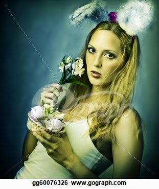
Other than being sort of a ridiculous picture, I'll explain why this is a bad photo to choose. The filter used. Avoid colored filters and textures. You want simple backgrounds and models that haven't been photoshopped too much. You want clear. You want big images. choose large images to purchase. When we work with images in GIMP, we don't want a lot of pixelation. It really can ruin the cover and make it look very unprofessional.
Here's an example of a good photo. This is stock I've purchased for cover work for a client.

Obviously for an erotica cover, but notice how clear it is. It's a large image as well. The background is very simple. As a cover designer, I have hundreds of stock photos. You won't need that many if you're designing just for yourself. Stock photos run me about 3-5 dollars for one picture. That's not bad! I think most people can afford that. I use one site. They have pretty much everything I could ever need.
http://www.canstockphoto.com/ Great site. Tons of pictures of just about everything. You buy credits (15 and up) and then use the credits to purchase the use of the photo. The photos purchased from this site allow commercial use.
THIS IS IMPORTANT! If you find some good, free stock, make sure it says it allows commercial use. Sometimes, they don't and require you to pay some money in order to use their pictures for commercial purposes.
Good places to find free stock: www.deviantart.com and http://www.entrepreneur.com/article/238646 The last link offers links to some of the best, free stock sites that allow for commercial use.
What to avoid:
You want to stand out but at the same time, you want to fit in. A hard place to be. It's important, I think, to follow/pay attention to trends and take inspiration from this. Don't copy. Take inspiration.
A special note to romance authors:
Stop the headless torso abuse. There are too many of these covers. I did a quick google search and came up with this. Ha.

Torsos! Torsos everywhere! I think at this point, there's nothing you can do to that sort of cover that helps you stand out.
Font:
Now, on to font. Font, like images, sometimes have to be purchased. These are usually pretty expensive. Especially if you're working on a very tight budget. And you've already purchased a stock photo.
There are a TON of free fonts for commercial use. www.dafont.com was recommended on my FB post about this blog and I couldn't agree more. It's what I use. It also tells you where you can use the fonts and how. Again, you'll want to look at other covers and see what they're doing.
What to look for in a good font: Readability. Does it make sense for your cover? Picking a hand drawn script font for a hard boiled detective novel is probably not your best choice.
Fonts to avoid. Avoid them forever.
This is going to upset some people, I realize. I apologize for that in advance. This is designed to help!
Moving on. These fonts are terrible. Awful.
Papyrus

Why it's bad: Overuse. And it's just not a pretty font. There are better ones. If you're going for Old World, etc, there are just better fonts out there. It's become the Ariel font of 'fancy fonts'. It's just used too much. People literally make parody book covers using this font. Avoid.
Stencil

Why it's bad: Again, overuse. I see it slapped on there in bright colors over an image and it is literally telling me nothing about the book. I see it on all genres. I cringe every time. There are better fonts for military sub genres and for the love of all that is holy, stop using this on zombie novel covers.
The Twilight font. You all know what it is. No. Just no.
Overly loopy romance-y script fonts. Stop. I can't read them. Neither can anyone else.
Big, ugly chunky blocky fonts. Sure, I can read them. But they offend mine eyes.
Great fonts:
Trajan Pro. It's an excellent font! It's bordering on overuse, however. Just about every movie poster ever has it. Keep it to the tag lines.
Great Vibes: A script font that is easy to read and conveys romance.
Helvetica: Hipster-y, I realize, but a nice font anyway.
Baskerville: Simple. Clean. Classic.
Garamond: Another clean, professional looking font.
The last word on fonts:
Can you READ IT? Font on book covers should probably be white or black. It just helps with the readability. Watch putting a lot of special effects on your fonts (glows, embossing, etc). It looks tacky most of the time. There are exceptions, but remember, less is more. Especially with font. Don't go gimmicky with your font. It's tacky. Look at movie posters, best selling books, etc. See what font they use. When in doubt? Google it!
Now for the technical side of things. Let's say you've found your perfect font. How the heck do you get it into GIMP? I will show you. It's amazingly simple.
I'm using dafont.com as an example. I'm choosing a deco font because it's nice! Go to download, click on it.

When you download a font, check the file. You will get a zip file. In order to open a zip file, you will need a program like WinZip. Google it, download it. It's free on a trial basis, but you can use it forever. Follow the instructions for the install. If you have trouble with this, message me. I'll try to help you.
Okay, you're going to want to extract the files from the zip folder into your GIMP folder. Under fonts. Make sure the file extension says .ttf. But I've never downloaded a font that didn't have that extension. Still, something to be aware of.

To find your GIMP folder: Go to OS ---> then to Users. Open your user file (probably your name) and then open GIMP. Then click on fonts. Hit 'OK'.

That's it! If your GIMP is open when you install the font, you will need to close it out and re-open it for it to show on your font list.

On your left, in the tools dialog box, you will see a bold A. That brings up the font dialog box. From there, you click on the font already there and it will bring down a drop box. The fonts are organized in alphabetical order and you can find your font easily that way. Click on it. Then click on the background and start typing. The font dialog box allows you to change the size. The default size is 18. That's WAY too small for a book cover. MOST book covers are done with size 300. Author name 175. Taglines: 100. That's the formula I use. And it works. Some fonts, however, are bigger than others so you need to play around and see what works best.
Notice too, that the font is now on a new layer! Hurray! This lets you manipulate the font without changing the background. Remember, GIMP works in layers.
Okay. That's it for today. Part 3 will come tonight or tomorrow. I will then start getting into the nitty gritty of book cover design. Choosing and working with color and how to manipulate your stock photo (ie: How to remove the background, how to change the colors, how to add borders, etc).
Thanks for stopping by! I hope you found this helpful.
Cheers-
Lillian
Another great tutorial. I am in such agreement with you on Papyrus. UGH. I hate that font. If I see that font on a book cover, I won't buy it. Same for script fonts. I don't know why people use them if no one can read them. And they aren't really that pretty.
ReplyDeleteThanks Rachel!
I think it's just inexperience, honestly. The font is used so much, people probably assume it's popular for GOOD reasons.
Delete